A well-designed mobile menu ensures that your visitors can easily navigate through your website, leading to higher engagement and conversions. If you’re wondering how to create a mobile menu in WordPress, follow the below steps.
Steps to create a mobile menu for Apper Theme in WordPress:
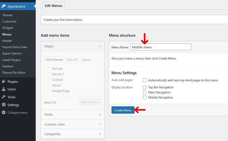
- Click on Appearance -> Menus
- Under Menu structure type the menu name in the “Menu Name” option
- Click on Create menu
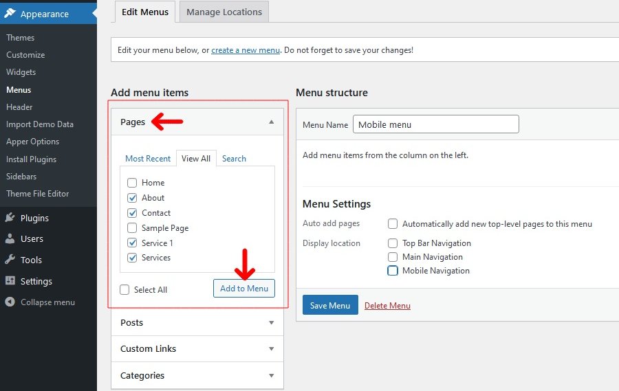
- Select the menu items you want from the left column and click on Add to Menu button to add to the “Menu structure“.
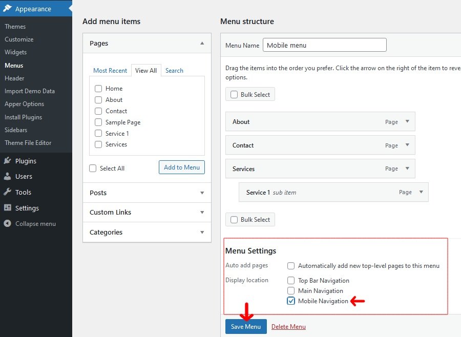
- Under Menu Settings select “Mobile Navigation” under Display location
- Click on Save Menu.